Data visualization tools have made it easier for anyone to turn data into beautiful dashboards in record time. We have put together this comprehensive list to help you find the perfect tool for your visualization requirements.
For all 71+ best data visualization tools, we covered their uses, features, differentiators, and price (free, open source, and/or paid). And organized them into meaningful categories.
Here is a list of what is covered, in one view.
| Category | Data Visualization Tools |
|---|---|
| Business Intelligence | Tableau, Microsoft Excel, QlikView, MicroStrategy, QlikSense, SAS Visual Analytics, DOMO, TIBCO Spotfire, Looker, Zoho Reports, Information Builders WebFocus |
| Timeline | Simile Widgets Timeline, Timeline JS |
| Charts | Google Charts, FusionCharts, DataHero, Visual.ly, Jolicharts, iCharts, Flot, Datawrapper, ChartBlocks, Highcharts, Mentimeter |
| Dashboards | SAP Lumira, Plotly, Many Eyes, Visualize Free, Infogram, Databoard, Q Research Software, Dapresy, RAWGraphs, Flare, Chartio |
| Maps | Exhibit, Carto, Open Layers, Polymaps, Instant Atlas, Modest Maps, Google Maps, Leaflet |
| Programming | R Programming, Python, Weka, Quadrigram, JpGraph, Processing, NodeBox, Gephi, Cytoscape, NetworkX |
| JavaScript | Amcharts, Prefuse, jqPlot, Javascript InfoVis Toolkit, Crossfilter, Tangle, Kartograph, Processing.js, Dygraphs, Chart.js, Raphael, Envision, Arbor, ZingChart Springy, BonsaiJS, D3.js, Miso, Better World Flux |
| More | CSV/JSON, FF Chartwell, WolframAlpha, Trifacta Wrangler |
Business Intelligence
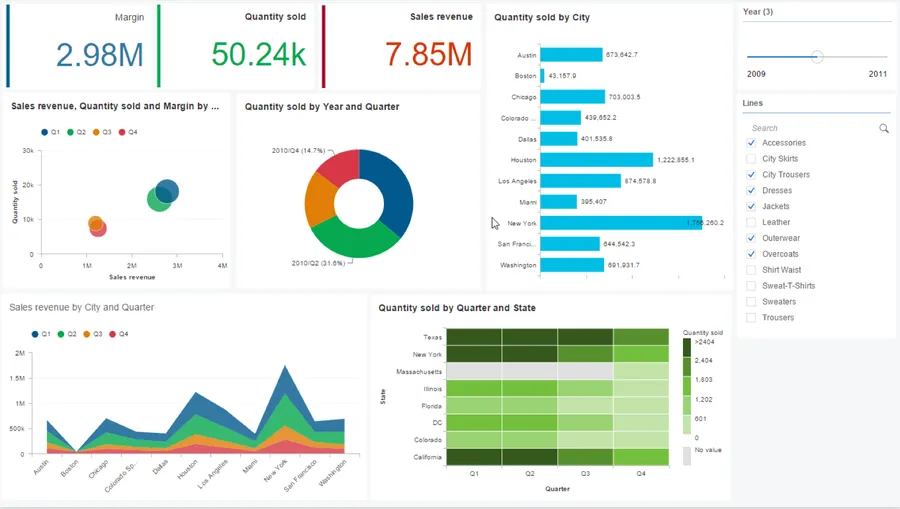
Transform your data into visualized actionable insights, both strategic and tactical. Create interactive dashboards, reports, summaries, graphs, charts, and maps. These can help make better-informed decisions.
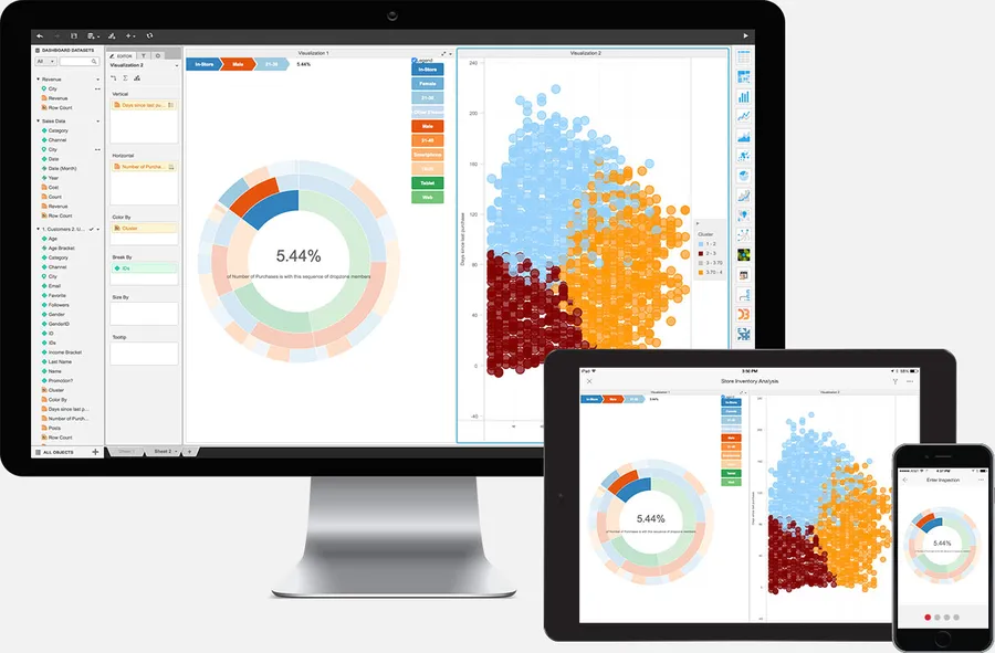
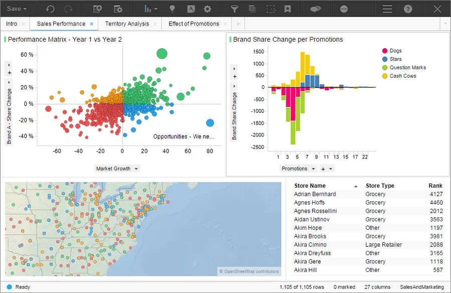
Tableau
It is one of the most popular and easy-to-use data visualization tools. You can create beautiful interactive charts, graphics, maps, and other useful elements. The public version is free and allows embedding on any web page with a credit link in the footer.
They also feature an online gallery that showcases visualizations for inspiration. It includes entries from Tableau users across the world.
- Easy to use with drag and drop, no programming skills required
- Integrates well with many different data source types
- Has advanced storytelling and collaboration capabilities
Price: 14 days free trial; starts at $35
Microsoft Excel
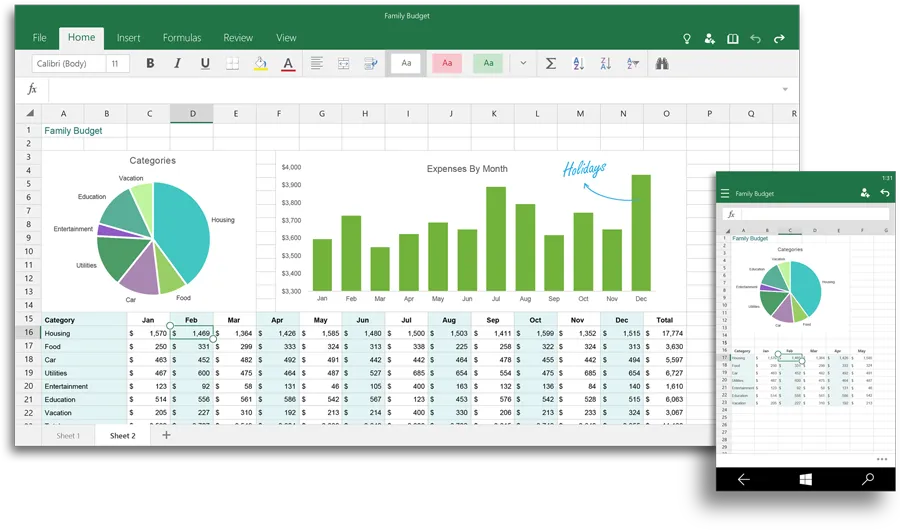
It is one of the most popular productivity applications in the world. It is primarily used for data analysis and business logic applications. But can create impactful data visualizations. It recommends charts based on your data and allows detailed customization.
- Features quick comparison of data representations
- Ability to make complex charts such as heat maps and scatter plots
- Extensive layout and format customization
- Analyze and visualize within the same application
- Widely accessible through Windows, iOS, and Android platform
Price: Starts at $9.99/month
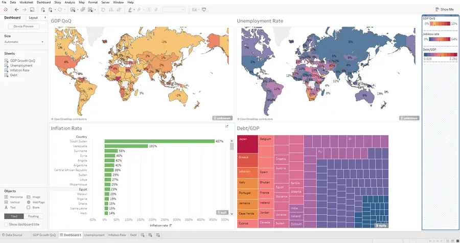
QlikView
A visualization tool developed by Qlik. This tool experienced phenomenal growth in the last five years. It is positioned in Gartner’s Magic Quadrant as a Leader among Business Intelligence and Analytics Platforms.
- Rapid real-time processing due to efficient in-memory capability
- It is a guided platform thus requiring less IT interference
- Robust search mechanisms for finding data
- Ability to combine multiple data sources with ease
Price: Free
MicroStrategy
MicroStrategy provides business intelligence, mobile software, and cloud-based analytics services. It has a user-friendly data visualization feature set. It enables the drag-and-drop creation of robust graphs, charts, and maps. You can enhance its capabilities with third-party integrations like D3.js. It allows the creation of new methods using Visualization Builder and SDK.
- Precise control though text, colors, size, shapes of the plotted data points
- Easy to use through drag and drop interface
- Ability to expand capabilities
Price: Starts at $600
QlikSense
Qlik Sense is a popular business intelligence and data visualization tool. It enables you to create dynamic and interactive dashboards. For different user needs, it comes in three editions: Desktop, Enterprise, and Cloud.
- Drag and drop dashboard creation
- Features shared object library and storytelling platform
Price: Free
SAS Visual Analytics
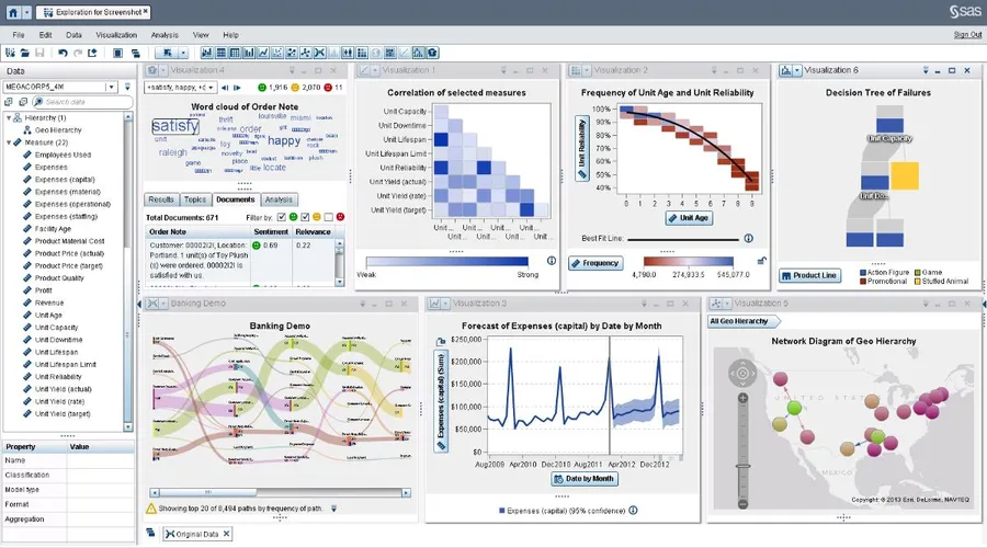
Developed by one of the leaders in the analytics industry – SAS. It extends the SAS capabilities through an intuitive drag-and-drop platform. It can produce beautiful dashboards and other visualizations.
- Ability to deploy local or on public/private cloud
- Recommends various layouts based on data
- Ability to identify potential correlations
- You can view DataViz as interactive web reports, pictures, or on SAS mobile apps
Price: 14 days free trial
DOMO
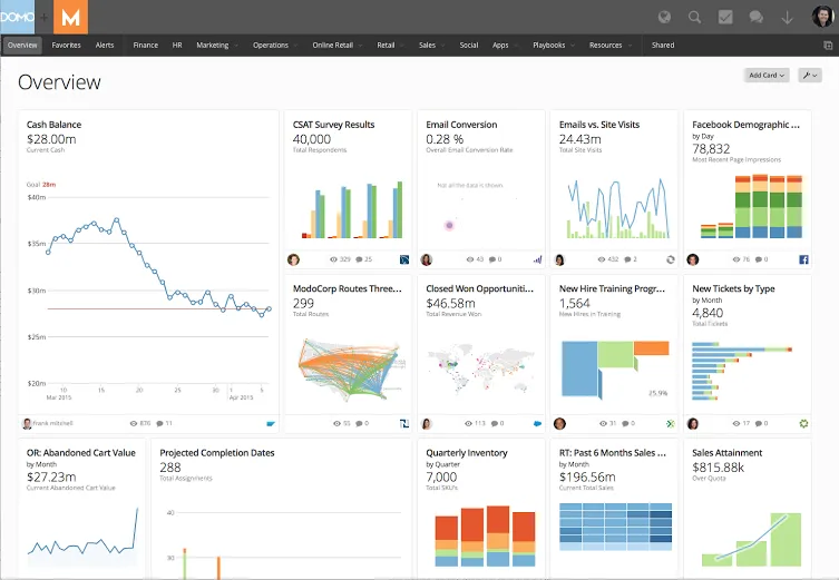
Domo is a well-funded venture – $689m as of April 2017 by T. Rowe Price, Fidelity Investments, and Salesforce. Founded by serial entrepreneur Josh James in 2010. Its clientele includes eBay and National Geographic. It is available as both cloud-based and on-premise BI platform. The company markets it as “One modern platform to run your entire business”.
- Features its app store with 1,000+ apps
- Allows the ability to create own apps authenticated API driven access
- Easy to create any micro or macro level dashboards
- Includes native support for 450+ data source connectors
- Create custom alerts on major business data changes
Price: 30 days free trial
TIBCO Spotfire
Spotfire is a powerful BI tool. It processes raw data through in-memory and in-database analytics architectures. It has an intuitive wizard that recommends visualizations based on selected data.
- Allows dashboard publishing through zero-footprint web client
- Ability to decipher unstructured text-based data
- Features data augmentation, predictive/prescriptive analytics, and diagnostic analytics
Price: 30 days free trial; starts at $25/month
Looker
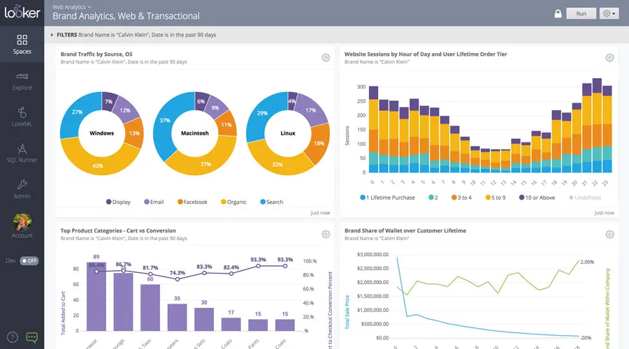
A cloud-based business intelligence platform. It can be used to integrate, analyze and visualize data. It is created to support various industries, departments, and database types. It is recognized as a strong BI performer by Forrester Wave. Its clientele includes Cigna, Nordstorm, Lyft, AthenaHealth, and Spotify.
- Interactive web-based visualizations across the entire data ecosystem
- Compatibility with D3.js charts
- Easy to drag-and-drop on the dashboard
- Real-time data updates
Price: Price on request
Zoho Reports
It is Zoho’s take on cloud-based business intelligence and analytics. Like most BI platforms, it can integrate data from various sources. Further, analyze and visualize data. It is compatible with other tools in the Zoho Suite.
- Supports white labeling of the interface and dashboards
- Easy embedding to any web page
- Ability to combine multiple reports into a single beautiful dashboard
Price: Free; starts at $25/month
Information Builders WebFocus
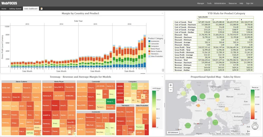
A scalable BI and analytics platform. It utilizes in-memory processing to generate valuable insights for businesses. It aims to reduce reporting and analyzing processes. It helps predict new market opportunities, discover hidden trends, and increase operational efficiencies.
- Doesn’t need severe data processing power
- Customize-able portals, menus, and page layouts
- Features Mobile Faves, an iOS and Android mobile app. It makes reports and dashboard viewing easy
Price: 14 days free trial; price on request
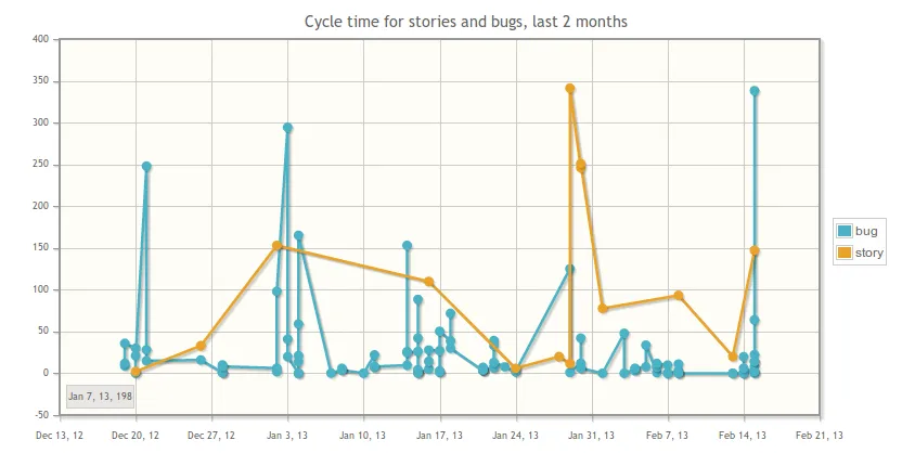
Timeline
Represent your time-based story on an interactive view. It can be used for many purposes – analysis, history, events, evolution, growth, and more. The sky is the limit.
Simile Widgets Timeline
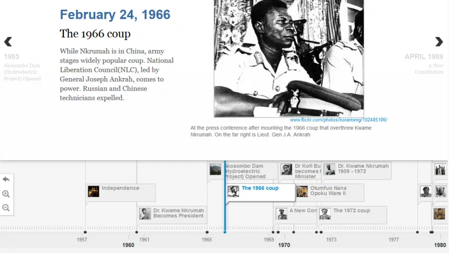
Simile Widgets Timeline is known as “Google Maps” for time. You can use it to create beautiful interactive timelines. It enables you to create an exhaustive timeline. And can make clickable areas to reveal more in-depth information.
- Has an extensive wiki to support development
- Features 10 examples including a timeline for – the life of Monet, Christianity, and JFK’s assassination
- An open-source project license under BSD
Price: Free
Timeline JS
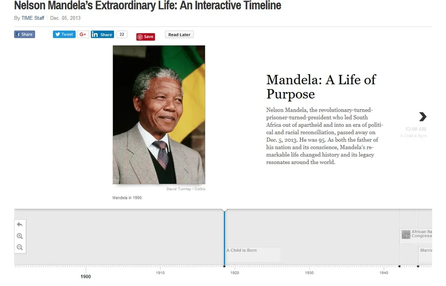
Timeline JS is a powerful open-source JavaScript library for building responsive timelines. It is capable of pulling data and media from various sources. Sources include Twitter, Flickr, Google Maps, YouTube, Vine, Dailymotion, Wikipedia, SoundCloud, and more.
Its functionality can be further extended using custom JSON installations. It is used by popular websites like TIME, Engadget, CNN, Mashable, Le Monde, and The Maneater.
- Provides spreadsheet template to quickly build timelines
- Also available as a WordPress plugin
- Features a 4-step process and support documentation
Price: Free
Charts
A colossal amount of data is created at a lightning speed. In past, it was difficult to imagine data visualizations in real-time. The tools below make it possible. Besides, it makes the process customizable and makes charts respond to the user’s touch.
Google Charts
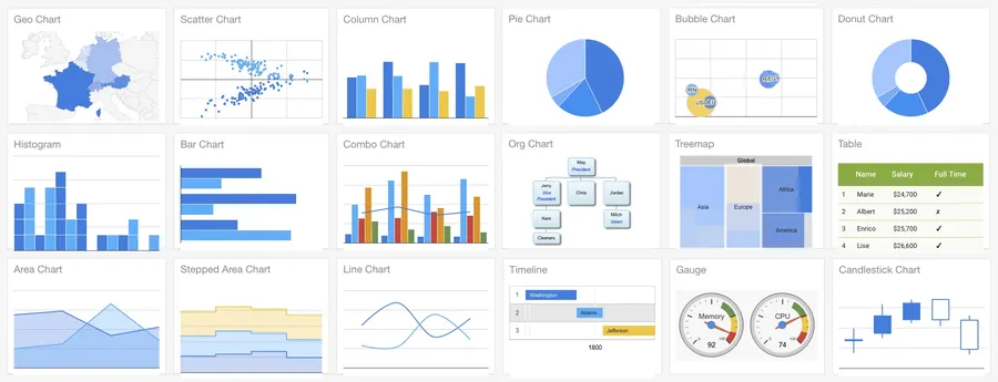
A very popular collection of flexible and developer-friendly visualizations. Built on HTML, CSS, and SVG for cross-browser and cross-platform compatibility. They support integration with real-time dynamic data sources.
- Supported by all modern browsers and devices
- Large collection of charts, geo charts, gauges, and graphs
- Supports VML for IE compatibility
Price: Free
FusionCharts
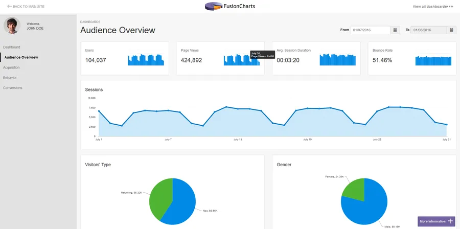
A large collection of beautiful, interactive, and customizable charts and maps. It supports all modern browsers along with Internet Explorer 6. It features a gallery of business dashboards and other demos for inspiration.
- Has JSON, XML and AJAX support
- Can export charts in PNG, JPEG, SVG, or PDF
- Easy to create and integrate on other platforms
Price: Starts at $199/year
DataHero
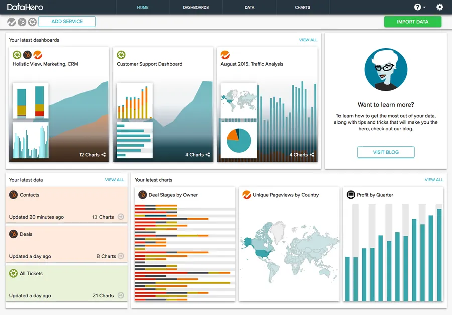
A simple tool that doesn’t need technical abilities. It helps pulls data from various cloud services and create beautiful dashboards.
- Uses a built-in Data Decoder to classify and normalize data
- Uses machine learning to identify matching attributes
- Features drag-and-drop cohort analysis, point-and-click change, and cumulative graphs
Price: 14 days free trial; starts at $59/month
Visual.ly

It is a visual content gallery and visual content creation platform. It delivers high-impact videos, infographics, ebooks, presentations, photography, social media content, writing, content strategies, and content illustrations.
- Has over 1,000 qualified freelancers
- The clientele of 1,100 brands including VISA, Ford, Nike, National Geographic, etc.
- A good resource for visual content inspiration
Price: Price on request
Jolicharts
It combines data analysis and presentation capabilities in one platform. It can connect to many data sources and handle big data challenges. The graphs and charts can be embedded into your apps or websites using REST-based API.
- Enables sharing with anyone online with a simple web URL
- Supports drag-and-drop to create dashboards
- Ability to export to XLS, PDF, or JPG formats
Price: Free; starts at €29/month
iCharts
A cloud-hosted platform to create interactive data visualizations for the web. Their charts are customizable. It can change variables, subject matter, and color schemes. It can pull data from multiple sources. Sources include Google Docs, Microsoft Excel spreadsheets, and more, and updates in real-time.
- Brand the charts with your brand logos
- Allow third party sites to embed your charts for enhanced exposure
- Ability to build custom forms for generating leads
- Measures views, shares, and embeds
Price: Starts at $35/month
Flot
A robust JavaScript plotting library for jQuery. It works on all major web browsers including Internet Explorer 6. It helps you manipulate animation, chart type, interactivity, presentation, etc. with great control.
- Features various customization options for lines, plots, filled areas, data points, and more
- Supports standard DOM manipulation and HTML
- Supports plotting of categories and textual data
- Ability to draw custom shapes
Price: Free
Datawrapper
Many major publications and news organizations use Datawrapper to showcase their data. Users include CBS, The Times, Fortune, and Daily Nation. As soon as you upload the data into the field, it generates a related graph.
- All charts are fully responsive
- Features ability to brand based on your brand colors
- Enables interactive charts that also interact with mouse hovers
- Coding or design skills are not required
Price: Free; starts at €29/month
ChartBlocks
It claims to be the “world’s easiest chart builder app”. It is a well-designed app that enables you to create basic charts rapidly. As compared to other tools in this list, it doesn’t boast an extensive collection of charts. Their focus is to have few and keep it very easy for anyone to create and share fast.
- Supports most data sources
- Supports embedding on any web page
- Can export charts as PNG or editable vector graphics
Price: Free; starts at $8/month
Highcharts
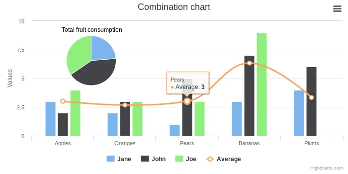
It is one of the most popular charting platforms today. It offers a huge variety of interactive charts, maps, and stock representations. It renders using SVG in modern browsers and VML in Internet Explorer. Its clientele includes famous brands such as Facebook, Twitter, MasterCard, VISA, Verizon, and Nokia.
- Supports Internet Explorer 6
- Can export charts to PNG, JPG, SVG, and PDF
- Free for personal non-commercial use
- Easy to experiment using JSFiddle
Price: Free; Starts at $430
Mentimeter
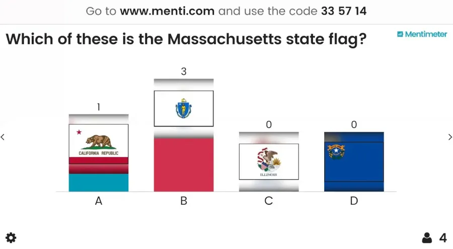
A tool for real-time data visualization based on user Votes. It is effective to use during webinars, presentations, workshops, and meetings. As users vote, their data gets presented on the presentation through various graphs. Their clients include Microsoft, Intel, Harvard University, Capgemini, and Uber.
- Free to use for two questions and five Quiz questions per presentation
- Provides security and privacy features, visual customization, and advanced visualization
Price: Free; starts at $7.99/month
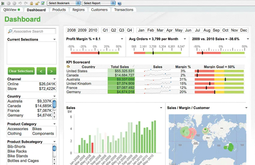
Dashboards
Dashboards are a need of every business executive. They are exceptional business management tools to simplify complex data sets. They provide visual performance depiction of enterprises and their specific departments or functions. They support real-time performance updates.
SAP Lumira
A self-service data visualization platform. It enables easy point-and-click data manipulation storyboards. It is available for both on-cloud and on-premise implementation. It integrates well with SAP data, especially SAP HANA.
- Helps create interactive storyboards to interpret data
- Priced per user – can be scaled for any business
- Allows sending visualizations through an email attachment or PDF
Price: 30 days free trial; starts at $185
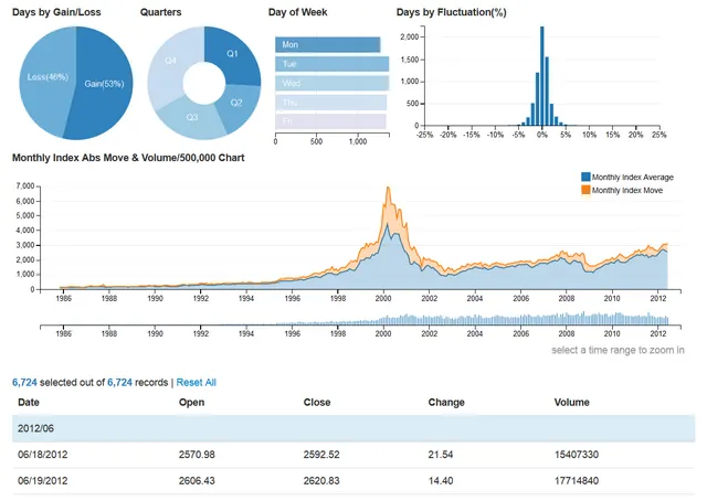
Plotly
A collection of open-source web-based data analytics and visualization tools. It features professional-looking charts and graphs. Helps generate by simply integrating a CSV file or SQL database through Falcon. It can help you customize layouts, legends, notes, axes, etc.
- Enables white-label data visualization
- Supports R, Python, and JavaScript
- Allows exporting to HTML, EPS, SVG, WebGL, and PDF
- Requires no installation
Price: Starts at $59/year
Many Eyes
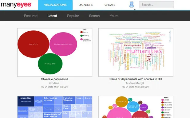
IBM Research and IBM Cognos Software Group created an experimental platform called Many Eyes. It can help create various visualizations types to show relationships between data points. It allows comparison of value sets, creates different kinds of graphs, analyzes text and data, and interacts with elements to further drill down. It is now closed.
- Make your creations publicly accessible
- Displays data using Java and Flash sets
- Collect feedback through user ratings
Price: Free
Visualize Free
A cloud-based visualization tool. It allows the use of public data sets or your own. It can help build interactive visualizations and share. It is based on the commercial platform InetSoft. Its development requires Flash that can be exported in HTML5.
- Zero-client drag-and-drop designer
- Viewers don’t need to register to view your shared output
- By default visualizations are private
Price: Free
Infogram
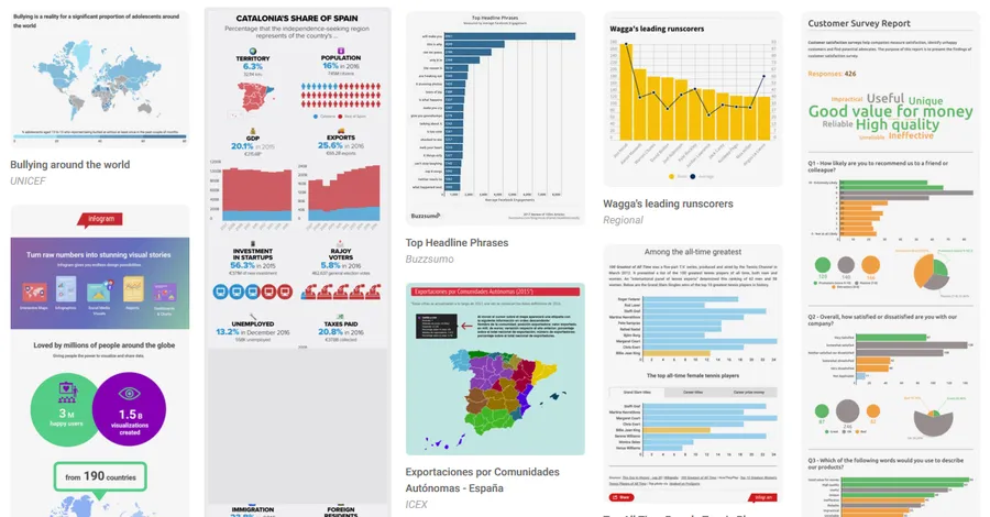
Infogram has an easy-to-use drag-and-drop based graphical user interface that supports over 35 charts and 500 maps. It also features 1 million ready-to-use images, icons, and flags with the ability to add your own.
- Supports responsive web embedding
- Supports Facebook’s Instant Articles, Medium, and WordPress
- Supports various data sources – text, cloud services, spreadsheets, and API
Price: Free; starts at $25/month
Databoard
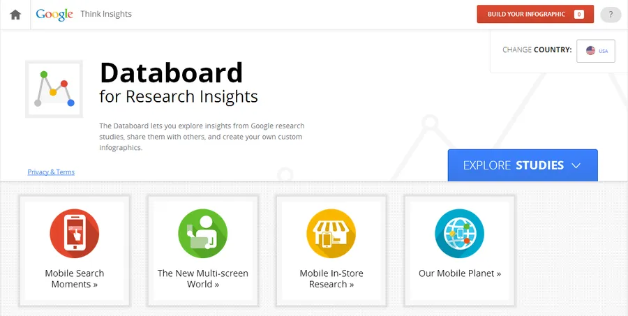
A tool from Google from their “think with Google”. It is positioned for business owners. It uses insights from Google research studies. It can create custom visualizations that are embeddable on your website or social media. Focuses on mobile search, multi-screen world, consumer behaviors, and trends.
- Ability to quickly generate graphics
- Supports including many components into one
- Helps in building data-oriented business or marketing strategy
Price: Free
Q Research Software
A DataViz platform for researchers. It enables interpretation, analysis, and creation of charts with your data. It can export to Microsoft Word, Excel and PowerPoint, and PDF. It supports extensive components for custom visualizations.
- Creates editable Microsoft Office graphics
- Updates tables and charts with real-time data
- Supports most major charts, histograms, and scatter plots
- Has powerful analytics capabilities including logic, latent class analysis, regression, max-diff, random parameters, Kruskal, Shapley, TURF, etc.
Price: Starts at $1599/year
Dapresy
A SaaS platform specializing in market research and customer experience data to create infographics and dashboards with an easy drag-and-drop GUI. It supports the complete spectrum from data analysis to presentation.
- Robust data integration and processing
- Supports deep analysis and drill-downs
- Can create dynamic elements for dashboards
- Ability to transform a 300 slides presentation into a few dynamic dashboards
Price: Price on request
RAWGraphs
Creators of RAWGraphs describe this tool as “the missing link between spreadsheets and vector graphics”. It is built on one of the most powerful data visualization platforms D3.js. All its interactions are well designed. It is open-source and free to customize without any registration.
- Processes data in the browser, hence data is safe
- Highly customizable and accepts custom layouts
- Supports exporting to SVG or PNG and cab be easy embedded into your web pages
Price: Free
Flare
An Adobe Flash Player based data visualization tool. It is an open-source ActionScript library that is capable of generating complex interactive graphs. Flare supports data management, visual encoding, animation, and interaction techniques. It has been used by Slate, the IBM Visual Communication Lab, BBC, and ABC News.
- Features a collection of demos for reference
- Provides API documentation, help forum, and tutorials
- Adapted from its predecessor Prefuse
Price: Free
Chartio
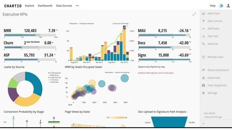
A cloud-based data exploration platform. It is capable of building beautiful charts and interactive dashboards. Users can connect various data sources and drill down through dashboard options to derive insights. Its functions are categorized as – connect, explore, transform and visualize. Its clientele includes SquareSpace, Udemy, Thomson Reuters, Shazam, Change.org, and GAP.
- Features a collection of various resources, guides, white papers, webinars, reports, and data tutorials
- Built on SQL
- Features scheduled sharing of reports without installing any software
- Ability to brand visualizations
Price: 14 days free trial; price on request
Maps
Add life to your location experience with advanced mapping, geospatial analytics, and visual geography integration.
Exhibit
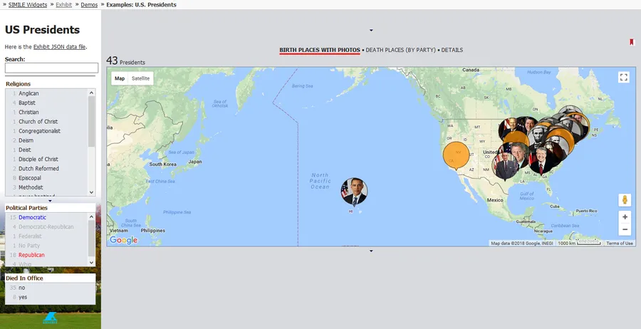
An open-source project under a BSD license, developed by MIT. It helps in quickly creating web pages with interactive maps and other data-based visualizations. It is orientated towards teaching or static/historical based data sets, such as various timelines, flags pinned to countries, or birth-places of famous people, etc.
- JavaScript library allows easy additions filters, searches, etc.
- Enables maps, charts, time-plots, calendars, facets, etc.
- Visual elements can be controlled using CSS properties
Price: Free
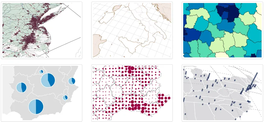
Carto
A powerful tool to integrate millions of data points with maps and create splendid visualizations. Its geospatial analysis feature lets you explore, refine and derive insights from your data.
- Ability to make data changes directly on maps
- Rapid application deployment with cloud-managed databases, APIs and SDKs
- PostGIS compatibility
- Supports raster and vector data
- Uses CartoCSS for style customization
Price: 30 days free trial; starts at $149/month
Open Layers
A steadfast tool to create various kinds of dynamic maps and integrate them on any web page. Due to Javascript API implementation, it doesn’t have any server-side dependencies. It supports Canvas 2D, WebGL, HTML5, CSS, and third-party libraries to extend functionality.
- Natively mobile ready
- Can pull tiles from OSM, Bing, MapBox, Stamen, OGC mapping, and others
- Ability to render vector data from GeoJSON, TopoJSON, KML, GML, Mapbox vector tiles
- Has quick start guide, tutorials, and API docs for help
Price: Free
Polymaps
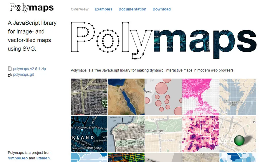
A Javascript library that helps create an image and vector tiled dynamic interactive maps using SVG. It is built on a spherical Mercator tile format. It supports multi-zoom, detailed drill-downs, and cartography from OpenStreetMap, CloudMade, Bing, and other providers of image-based web maps.
- Features 15+ robust examples
- Has detailed documentation to help you map faster
- Can easy level down to states, cities, neighborhoods, and individual streets
Price: Free
Instant Atlas
A platform to visually transform and present location-based statistical data from various data sources. It is used by statisticians, analysts, researchers, and GIS professionals. It delivers interactive maps without any server or data connections.
- Features pre-built templates to customize and brand the outputs
- Allows users to discover patterns, trends, relationships, and anomalies
- Has extensive support resources and training services
Price: 30 days free trial; starts at $5970
Modest Maps
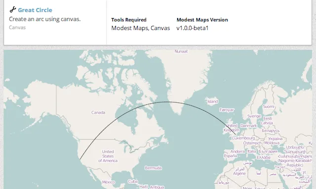
A simple and lightweight mapping tool. It is created for designers and developers who want to build and use interactive maps for the web. It is compatible with most major browsers and supports API with various hooks. Its functionality can be further extended through plugins.
- Compatible with MapBox.js, HTMAPL, and Easey extensions
- Also used as a platform for building mapping tools
- Provides several examples for getting started
Price: Free
Google Maps
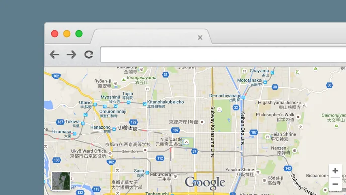
One of the largest maps platform in the world. It provides its APIs for developers to experiment and generate interactive visual maps. Easy to embed on any application or website. Its data includes Google Earth, Google Maps Images, and Google Places. Uber also uses Google Maps for navigating its riders and drivers.
- All maps are interactive with great visual details
- Supports PNG, GIF, and JPG formats
- Features tagging with longitude and latitude coordinates for accurate markings
Price: Free; price on request
Leaflet
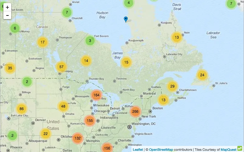
An open-source library focused on simplicity, performance, and usability. At 33KB it is a lightweight feature-rich platform. It supports mobile-friendly interactive maps. Output maps are rendered using HTML5 and CSS3 for cross-browser and cross-platform compatibility.
- Uses plugins to extend core functionality such as animated markers, heatmaps, etc.
- Eliminates touch delays on compatible devices
- Easily integrates with OpenStreetMap data
Price: Free
Programming
Various programming platforms enable rapid visualizations that can be used to perform statistical computations or complex analyses. Their output may not be as visually appealing as others in this comprehensive list but they get the work done.
R Programming
An open-source programming language for statistical computation and visualizations creation. It is a powerful yet complex platform. It has a dedicated search engine, strong community, and package library.
- Data manipulation, analysis, and visualization in the same tool
- Includes powerful features such as conditions, loops, matrix arithmetic, large pool of operators, and input/output functions
- Ability to program new functions for increased capability
Price: Free
Python

Python is a popular open-source high-level programming language for general-purpose programming. It emphasizes clear code syntax that is easy to read. It features two libraries for visualization – Matplotlib and Seaborn.
- Ideal for fast prototyping
- Much easier to visualize as compared to R
Price: Free
Weka
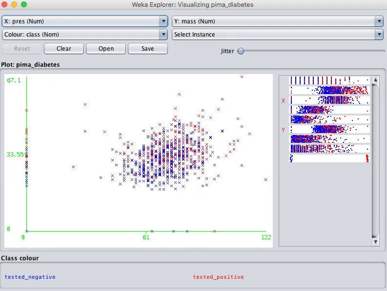
Weka is a set of visualization tools and algorithms for business intelligence. It supports data analysis and predictive modeling on a GUI-based platform.
- Provides various ways to categorize and cluster data based on different characteristics
- Allows selection of individual scatter plots that can be enlarged and analyzed further based on various operators
Price: Free
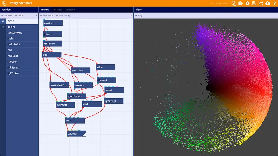
Quadrigram
Quadrigram enables the creation of interactive visualizations without any code. It is based on a Visual Programming Language (VPL) and is capable of connecting various data sources to create prototypes and data visualizations. It has a built-in library of customizable charts and graphs.
- Ability to create articles, presentations, or embedded visualizations
- Features a drag and drop interface
- Integration with R and Gephi
- Enables conceptualization and creation of rapid prototypes
Price: Free; starts at €19.95/month
JpGraph
One of the best PHP-based charting platforms. It includes an extensive range of charts and graphs that run server-side. It features alpha blending, Gantt-charts, multiple Y-axes, 400 named colors, internal caching with support of various plots.
- Supports drill-down of graphs
- Advanced interpolation of cubic splines to get better curves with few data points
- More than 750 pages of support documentation
Price: Free; starts at $103.74
Processing

Processing was created as a method to learn and teach code within the context of visual arts. Since 2011, it has gained traction among enthusiasts, students, designers, researchers, artists, and hobbyists to not just learn but create prototypes.
- The open-source platform, free to download
- Ability to output interactive 2D, 3D, and PDF
- Features 100+ libraries to extend the core functionality
- Supports Open GL integration
- Features good community support, documentation, and many books from leading publishers
- Enables creation of interactions, motion graphics, textures, and other animations
- Works on GNU/Linux, Mac OS X, Windows, Android, and ARM
Price: Free
NodeBox
An open-source set of tools for Mac OS for creating 2D graphics and visuals. It requires an understanding of Python. It is easy to tweak variables and update results in real-time. Developed by the Experimental Media Research Group.
- Free to use and has cross-platform compatibility
- Easy integration with standard design apps
- Integrates data from various formats, including Excel
Price: Free
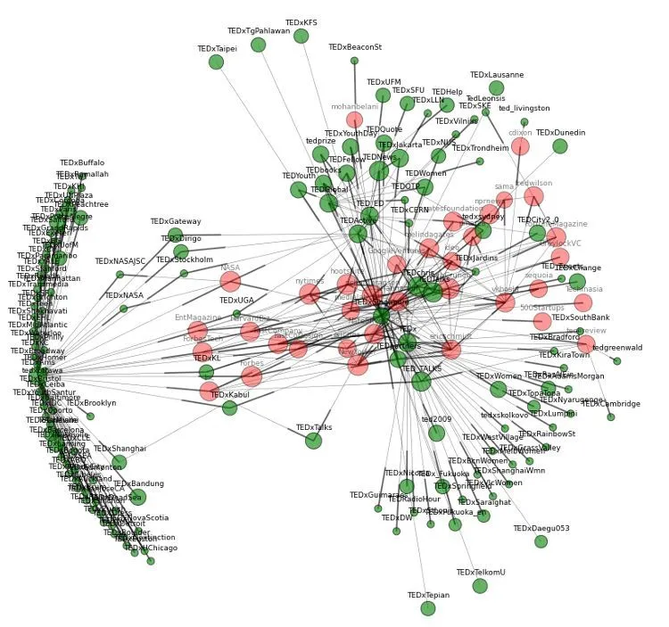
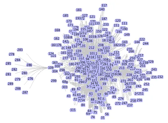
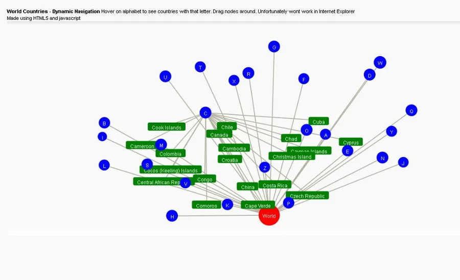
Gephi
Gephi is a great open-source application for visualizing data relationships. It features plugins for customization, deep data analysis, data linking capabilities, a built-in 3D rendering engine, and more.
- Runs on Windows, Linux, and Mac OS
- Ability to see the visual output in real-time
- Intuitive GUI with workflow organization
Price: Free
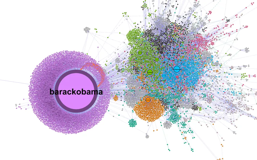
Cytoscape
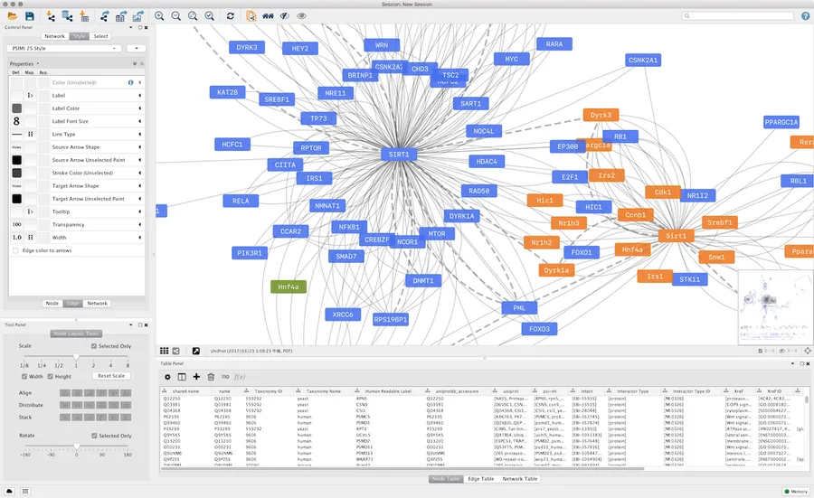
Cytoscape is used to build and integrate complex networks with different types of attributes. It was originally designed for biological research. It has particular features to analyze molecular relationships, bioinformatics, biological pathways, semantic web, and social network. It is feature-rich to create beautiful graphical representations.
- Can be used in combination with other tools – R, NetworkX, etc.
- Can visualize human relationships among social communities
- Has Java-based API and Cytoscape App Store to extend the core functionality
Price: Free
NetworkX
A Python-based platform to create, manipulate and process complex networks. It can produce graphs, digraphs, and multigraphs from various data sets and media formats. It supports many standard graph algorithms, network structures, and analysis measures. Due to Python being at the core, it can be used for fast prototyping, fast learning, and teaching, and utilize multi-platform compatibility.
- Utilizes nodes that can contain any media type including images and XML
- Edges can hold arbitrary data such as weights or time-series
- Free to use, open-source 3-clause BSD license
Price: Free
JavaScript
Over the years, JavaScript has proven itself to be an effective platform to develop visualizations of any kind or scale. Following are handpicked JavaScript-based tools and enablers for you to explore.
Amcharts
One of the most powerful and widely used charting JavaScript libraries today. It features charts, stock charts, and maps. Features a large collection of beautiful interactive demonstrations. Trusted by Microsoft, Amazon, PayPal, NASA, P&G, Apple, Samsung, Cisco, and more.
- Easy embedding with responsiveness
- Highly customizable – colors, styles, layout, animations, functionality, events
- Features a collection of resources and documentation
- One of the best customer service
Price: Free; starts at $140
Prefuse
A Java-based toolkit for creating interactive data visualizations. It enables building stand-alone applications or components to integrate with other applications. It features data modeling, data structures optimizations, encoding techniques, dynamic queries, and integrated searching capabilities. The Prefuse Flare toolkit offers visualization and automation tools for ActionScript and Adobe Flash Player. It was used by IBM Visual Communication Lab to create visualizations for its Many Eyes tool.
- Features animation, dynamic search, and database connectivity
- Uses Java 2D graphics library
- Licensed under BSD, can be freely used for commercial or personal use
Price: Free
jqPlot
A jQuery JavaScript framework-based plugin that produces various chart types, customizable data axes, up to 9 Y-axes, automatic trend line calculation, tool-tips, etc. Its major feature is compatibility with pluggable “renderers”.
- Open-source project under both the MIT and GPL Version 2.0 licenses
- Supports hook for custom event handling, creation of new plots, adding canvases, etc.
- Supports all major web browsers
Price: Free
Javascript InfoVis Toolkit
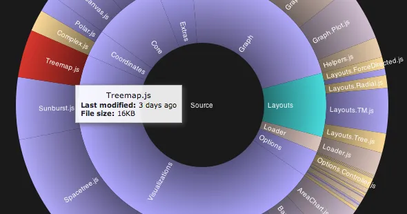
A set of JavaScript tools to create interactive visualizations for the web. Supports TreeMap, RGrapgh, HyperTree, Icicle, SpaceTree, Sunburst, ForceDirected, Area, Bar, and Pie.
- Features modular structure, loads only necessary files based on the chosen visualization
- Free to use, donations are encouraged
- Supports unique styles and animations
Price: Free
Crossfilter
A JavaScript library to explore large multivariate data sets in the browser. Due to single dimension views adjustments are made to filter values, thus making it significantly fast.
- Ability to support more than a million records with fast interactions (<30ms)
- Easy slice-and-dice of the data
- High-performance live histograms and top-K lists
Price: Free
Tangle
A JavaScript library that enables the creation of reactive programs. These programs provide a deeper understanding of data relationships by allowing users to tweak the input values and explore the outcomes.
- Any complex interaction can be drilled downed, enabling a sense of control
- Dragging variables can increase or decrease values on charts in real-time
- Ability to create dynamic charts, graphs, and other visualizations using defined variables, formats, and classes
Price: Free
Kartograph
A combination of JavaScript and Python library that enables designers and developers to create interactive SVG maps that supports all major browsers. It works stand-alone and does not need any mapping service such as Google Maps.
- Open source, licensed under AGPL (Python library) and LGPL (JavaScript library)
- Built on top of Raphaël and jQuery
- Renders vector maps from shapefiles and PostGIS
- Also supports Internet Explorer 7+
Price: Free
Processing.js
Processing.js is a porting platform maintained by Processing Visual Language. It helps the transition of output created using Processing without any extra plugins or extensions to web formats for easy publishing. It also features a port to Objective-C to use on the iOS platform.
- Allows Processing code to run on any HTML5 based web browser
- Easy porting and integration with any major programming
- Features community support and documentation for help
Price: Free
Dygraphs
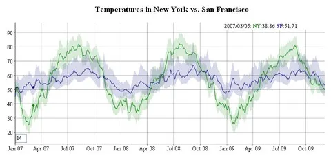
An open-source JavaScript-based charting library with the capability to handle large data sets. It works on all major browsers without any noticeable data load delay. Charts natively support interactivity such as pan, zoom, pinch to zoom, and mouse hover.
- Customizable using options and custom callbacks
- Has an active community and ample support documentation
- Features an examples gallery for reference
Price: Free
Chart.js
A simple open-source JavaScript library. It features various chart types – line, bar, area, scatter, radar, polar, pie, bubble, doughnut, and more. It supports HTML5, responsiveness, and flat design. It can be easily used as a visual representation tool for small projects that don’t require complex charting capabilities.
- Features an easy to follow documentation guide
- Data labeling can be enabled using a plugin
- Supports high customization with beautiful animations
Price: Free
Raphael
A lightweight JavaScript library for generating SVG or VML graphs through programming. It features vector graphics creation with cross-browser compatibility. It has customization capability by adding attributes such as color, rotation, stroke color, size, etc.
- Supports a variety of charts, graphs, and other visual representations with DOM objects
- Allows embedding on any web page
Price: Free
Envision
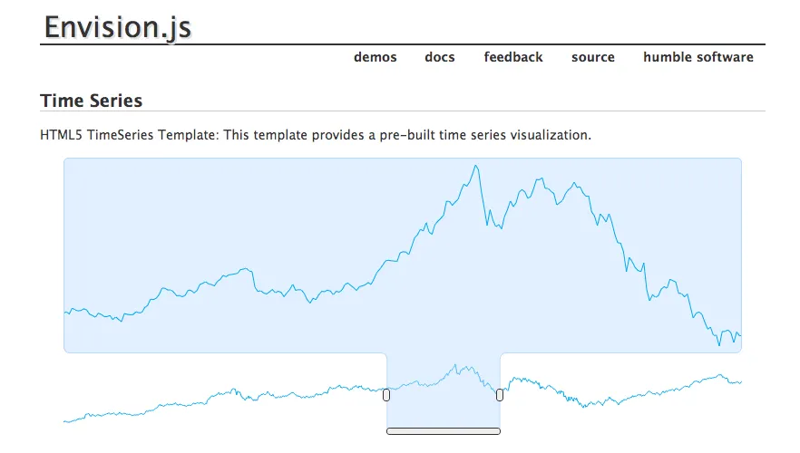
A JavaScript library that can create fast and interactive HTML5 based visualizations. Supports real-time data, time series, finance, AJAX-driven financial charts, and custom ones, including fractals.
Supports all major browsers including IE 6+
- Native compatibility with touch and mobile devices
- Framework agnostic
- Adapted to Flotr2
Price: Free
Arbor
A graph visualization JavaScript library built on web workers and jQuery. It uses canvas, SVG, or positioned HTML elements for interactive representation. It focuses on building a unique project using your data sets instead of spending time on physics mathematics.
- Handles real-time color and value tweens
- Features a force-directed layout algorithm plus abstractions for graph organization and screen refresh handling
Price: Free
ZingChart
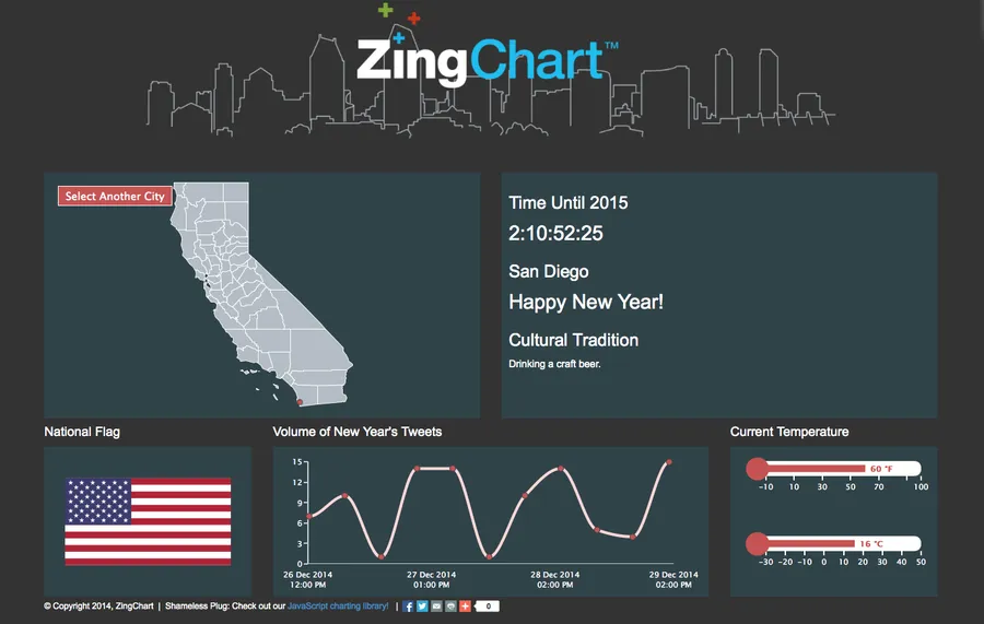
An extensive JavaScript charting library that supports pure JavaScript, AngularJS, React, PHP, jQuery, Ember, and Backbone. It can be used to create 100+ types of interactive Flash or HTML5 based charts.
- Frequently updated with developer support
- Customizable using CSS
- Updates data in real-time
- Supports responsiveness and touch functionality
- Has powerful JavaScript API
Price: Free; starts at $199
Springy
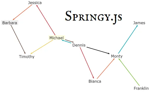
Springy.js is a lightweight JavaScript library that works on a force-directed graph layout algorithm to build network graphs.
- It works with canvas, SVG, WebGL, and HTML
- Can use plugins to further extend the core functionality
Price: Free
BonsaiJS

A simple JavaScript graphics library with an intuitive graphics API and an SVG renderer.
- Has an example gallery of 8 beautiful representations
- Features documentation for getting started with ease
Price: Free
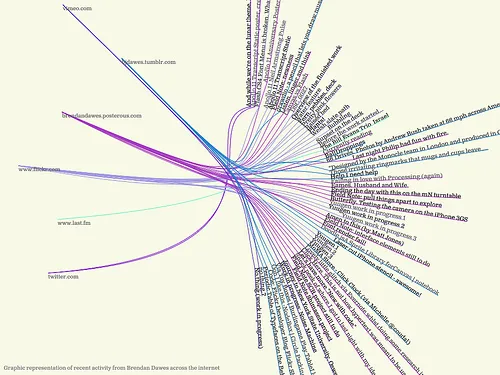
D3.js
D3.js, also known as Data-Driven Documents is an open-source platform to create some of the most powerful data visualizations today. It has compatibility with modern web browsers through HTML, SVG, and CSS. It features a data-driven approach to DOM manipulation.
- Highly interactive outputs
- Availability of plugins to enhance capabilities
- Features ability to bind arbitrary data to DOM
- A large gallery of beautiful interactive creations
- Doesn’t require any proprietary additions
Price: Free
Miso
An open-source toolkit help users create high-quality interactive storytelling and visualizations. It uses its dataset, storyboard & D3.js chart integration. A joint project between The Guardian and Bocoup. Also supported by GlobalDevelopment and The Bill and Melinda Gates Foundation.
- Constantly progressing through active development
- JavaScript client-side data management and transformation library
- Integration with D3.js charts library
- Event-driven content state and transition management
Price: Free
Better World Flux
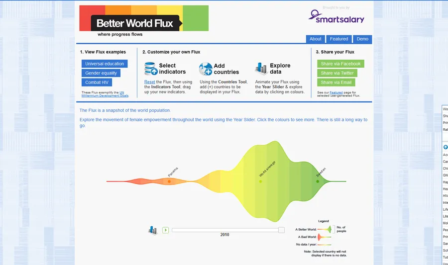
A platform thriving to make positive changes to the world. It is used to create interactive visualizations of some pretty depressing data for over 50 years – child mortality, HIV prevalence, life expectancy, sanitation facilities, undernourishment, ratio girls boys education, health expenditure, access to water, malaria cases, etc.
- Do not allow input of your data
- Features interesting trends and patterns
- Supports in raising awareness for UN Millennium Development Goals
Price: Free
More
CSV/JSON
CSV (Comma-Separated Values) and JSON (JavaScript Object Notation) are common data formats accepted by almost all data visualization. It is recommended to understand the structure, organization, and export of the data.
Price: Free
FF Chartwell
Unlike all data visualization tools on this list, FF Chartwell is a typeface. Designer Travis Kochel saw an opportunity to utilize the OpenType technology to simplify the chart creation process for those frustrated by chart applications.
- Works with Adobe Creative Suite
- No coding required
- Simple and easy to customize
Price: Starts at €25
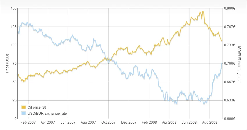
WolframAlpha
A search engine that instead of providing links to the right third party web pages it processes inputs with its mathematical algorithms to provide answers. It is also known as the “computational knowledge engine”. It can also be used as a powerful data visualization tool. For example, a query to plot on graph “plot x^3 – 6x^2 %2B 4x %2B 12” outputs the following result:
- It can be further used to customize, download and embed on your web pages
- Do not need any complex configuration
- Supports publicly available data
- Features a simple widget builder to embed easily
Price: Free
Trifacta Wrangler
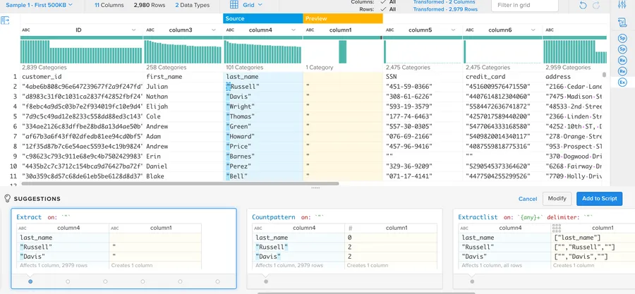
A tool to cleanse and prepare messy data for more accurate data analysis and visualization. As soon as you import your data, Wrangler automatically begins to organize and structure your data. Its machine learning capabilities can further help in aggregating and transforming data.
- Supports JSON, raw CSV, TXT, Tableau Data Extract, and Excel files
- Quality bar function shows the percentage of rows with missing, mismatching, or inconsistent values
- Free to re-use prepared recipes on many data sets
Price: Free
Although, I have tried to include most of the industry-leading data visualization tools. We might have missed out on some of your favorite tools, so why not talk about them in the comments section below?